Skip to content
Skip to content
Skip to content
Kalidon Hotels
Case study
(10/10)

Kalidon Hotels

Sector
Two family hotels, Kokkari, Samos
Hotels
Kalidon Panorama, Kalidon Beach
Services
Brand story, website, UX/UI
Languages
English and Greek
The brief

Two family hotels in Kokkari, Samos: one on the pine hill, one on the seafront. We found the story they already owned, the rings of their logo, and built the new site around it.

The story

A story of Samos.

(I)Samos

The island of circles.

The island of Pythagoras, who saw the planets move in perfect circles, and of Aristarchus, who put the sun at the centre. Around 550 BC two crews cut through Mount Kastro from opposite sides and met in the middle. A circle, a centre and two sides that meet: Samos had already written the brief.

Kalidon: The Kouros of Samos, 580 BC
The Kouros of Samos, 580 BC
Kalidon: The Eupalinian Tunnel
The Eupalinian Tunnel
(II)Kokkari

Rings within rings.

Kokkari takes its name from kokkari, the onion bulb once grown all around the village. Cut one in half and you find rings within rings, the same figure as the Kalidon mark.

Kalidon: Kokkari, from Kalidon Beach
Kokkari, from Kalidon Beach
(III)The mark

An eye, a plate, a ring.

The Kalidon mark is a mati, the Greek eye, painted in brushed rings. The same rings already hang on the room walls as ceramic plates. So the site adds no new symbol: it draws the rings Kalidon already owns, by hand.

Kalidon: The plate wall at Panorama
The plate wall at Panorama
Kalidon: The same plates, drawn for the site
The same plates, drawn for the site
(IV)The idea

Two hotels, one horizon.

The real difference between the two hotels is height. So the site is built on one line: Panorama lives above it, on the pine hillside, and Beach sits at its level, on the seafront. Every opening photograph starts from that line.

Kalidon: Panorama, above the line
Panorama, above the line
Kalidon: Beach, at sea level
Beach, at sea level
(V)Inspiration

Lake Como calm, Aegean light.

We studied the quiet grand hotels of Lake Como, where luxury means calm: very large photographs, slender type and nothing between the guest and the view. Then we gave it an island accent: whitewash and stone, the blues of the mati, and Greek set as carefully as English.

  1. (01)The photograph leads
  2. (02)Quiet type
  3. (03)Two hotels, never mixed
  4. (04)Nothing taken away
  5. (05)Booking one step away
  6. (06)Greek and English, equally
Kalidon: Panorama, the lounge window
Panorama, the lounge window
(VI)The look

Whitewash, stone and the mati.

A calm shared base, with colour only from the logo: blues for Panorama, teals for Beach. Titles in a slender display serif, text in a clean sans, both complete in Greek.

Shared
Whitewash#F1F1EC
Stone#E5E6E0
Night sea#10202B
Panorama
Mati navy#0A3C78
Panorama blue#1A5486
Aegean sky#52B3E3
Beach
Beach teal#00796F
Mati teal#00A89C
Sea mist#6CC0CC
Kalidon: Noto Serif Display and Manrope
Noto Serif Display and Manrope
(VII)The website

Two hotels, side by side.

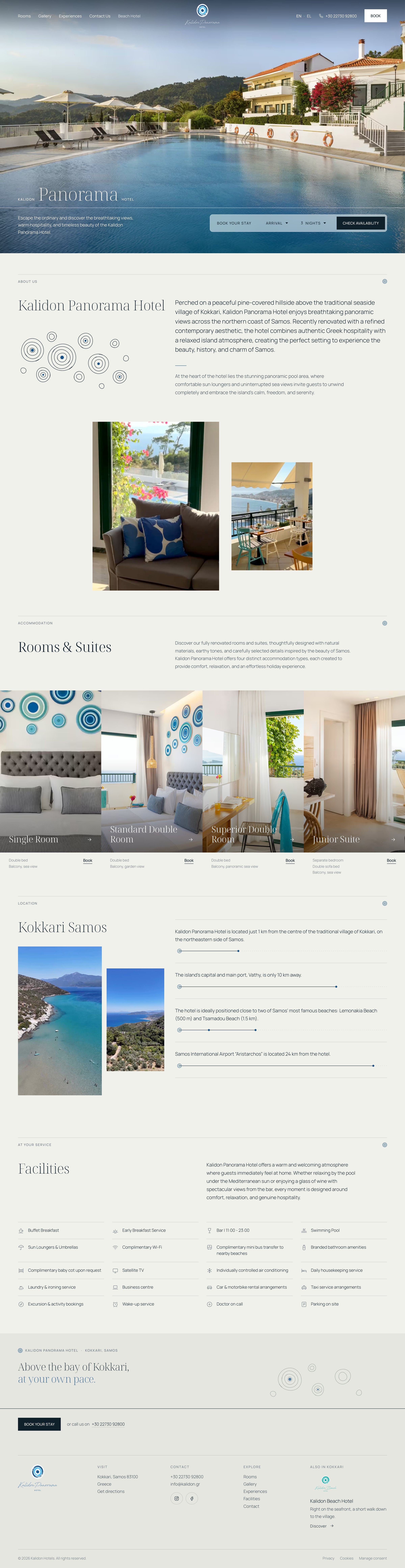
kalidon.gr opens on both hotels at once: Panorama by its pool above the bay, Beach by the Kokkari waves. Inside, each hotel keeps its own photographs, colour and logo, in English and Greek.

Kalidon: The first page
The first page
The site, live
kalidon.gr ↗
kalidon.gr
Kalidon Hotels website on desktop
Kalidon Hotels website on mobile

The site.(07)

What we did
(001)Brand storyThe island, the village and the logo, told as one story before the design began.
(002)DesignOne horizon for two hotels: full-width photographs, a slender serif and the logo’s rings drawn by hand.
(003)BookingDates in the opening photograph, phone and Book always in the header, a slim booking bar on phones.
(004)Two languagesEvery page in English and Greek, with typefaces chosen for Greek.
(005)TrackingA cookie banner with consent, a new Tag Manager setup and contact clicks counted as key events.
Kalidon Hotels
Case study
(10/10)
Kalidon Hotels
Sector
Two family hotels, Kokkari, Samos
Hotels
Kalidon Panorama, Kalidon Beach
Services
Brand story, website, UX/UI
Languages
English and Greek
The brief

Two family hotels in Kokkari, Samos: one on the pine hill, one on the seafront. We found the story they already owned, the rings of their logo, and built the new site around it.

The story
A story of Samos.
(I)Samos
The island of circles.

The island of Pythagoras, who saw the planets move in perfect circles, and of Aristarchus, who put the sun at the centre. Around 550 BC two crews cut through Mount Kastro from opposite sides and met in the middle. A circle, a centre and two sides that meet: Samos had already written the brief.

Kalidon: The Kouros of Samos, 580 BC
The Kouros of Samos, 580 BC
Kalidon: The Eupalinian Tunnel
The Eupalinian Tunnel
(II)Kokkari
Rings within rings.

Kokkari takes its name from kokkari, the onion bulb once grown all around the village. Cut one in half and you find rings within rings, the same figure as the Kalidon mark.

Kalidon: Kokkari, from Kalidon Beach
Kokkari, from Kalidon Beach
(III)The mark
An eye, a plate, a ring.

The Kalidon mark is a mati, the Greek eye, painted in brushed rings. The same rings already hang on the room walls as ceramic plates. So the site adds no new symbol: it draws the rings Kalidon already owns, by hand.

Kalidon: The plate wall at Panorama
The plate wall at Panorama
Kalidon: The same plates, drawn for the site
The same plates, drawn for the site
(IV)The idea
Two hotels, one horizon.

The real difference between the two hotels is height. So the site is built on one line: Panorama lives above it, on the pine hillside, and Beach sits at its level, on the seafront. Every opening photograph starts from that line.

Kalidon: Panorama, above the line
Panorama, above the line
Kalidon: Beach, at sea level
Beach, at sea level
(V)Inspiration
Lake Como calm, Aegean light.

We studied the quiet grand hotels of Lake Como, where luxury means calm: very large photographs, slender type and nothing between the guest and the view. Then we gave it an island accent: whitewash and stone, the blues of the mati, and Greek set as carefully as English.

  1. (01)The photograph leads
  2. (02)Quiet type
  3. (03)Two hotels, never mixed
  4. (04)Nothing taken away
  5. (05)Booking one step away
  6. (06)Greek and English, equally
Kalidon: Panorama, the lounge window
Panorama, the lounge window
(VI)The look
Whitewash, stone and the mati.

A calm shared base, with colour only from the logo: blues for Panorama, teals for Beach. Titles in a slender display serif, text in a clean sans, both complete in Greek.

Shared
Whitewash#F1F1EC
Stone#E5E6E0
Night sea#10202B
Panorama
Mati navy#0A3C78
Panorama blue#1A5486
Aegean sky#52B3E3
Beach
Beach teal#00796F
Mati teal#00A89C
Sea mist#6CC0CC
Kalidon: Noto Serif Display and Manrope
Noto Serif Display and Manrope
(VII)The website
Two hotels, side by side.

kalidon.gr opens on both hotels at once: Panorama by its pool above the bay, Beach by the Kokkari waves. Inside, each hotel keeps its own photographs, colour and logo, in English and Greek.

Kalidon: The first page
The first page
The site, live
kalidon.gr ↗
kalidon.gr
Kalidon Hotels website on desktop
Kalidon Hotels website on mobile
The site.(07)
What we did
(001)Brand storyThe island, the village and the logo, told as one story before the design began.
(002)DesignOne horizon for two hotels: full-width photographs, a slender serif and the logo’s rings drawn by hand.
(003)BookingDates in the opening photograph, phone and Book always in the header, a slim booking bar on phones.
(004)Two languagesEvery page in English and Greek, with typefaces chosen for Greek.
(005)TrackingA cookie banner with consent, a new Tag Manager setup and contact clicks counted as key events.

Let’s talk

Let’s talk

Let’s talk

Tell us what you’re building. We read every brief ourselves.

Reply time

Within one business day, from a real person.

Newsletter

The Studio Dispatch.What’s working, once a month.

No spam. Unsubscribe in one click. Privacy Policy

Contact

5.018 Google reviews

Partners

Moosend partner badge
Klaviyo partner badge
Google Partner badge
Meta Business Partner badge
Apple Ads badge
Sortlist agency profile
DesignRush agency profile
THECOMMERCE
in Athens
in Athens
in Athens

© 2026 THECOMMERCE® Digital Agency. ΓΕΜΗ 170887803000