Thermyès.
Named after the thermal springs of Kythnos, rooted in warmth: of water, stone and light.
- ClientThermyès
- SectorVilla
- PlaceKythnos, Cyclades
- Year2026

The thinking.
Named after the thermal springs of Kythnos, THERMYÈS is rooted in warmth: of water, stone and light. Unhurried and elemental, it holds the character of the Cyclades in every detail.
The mark
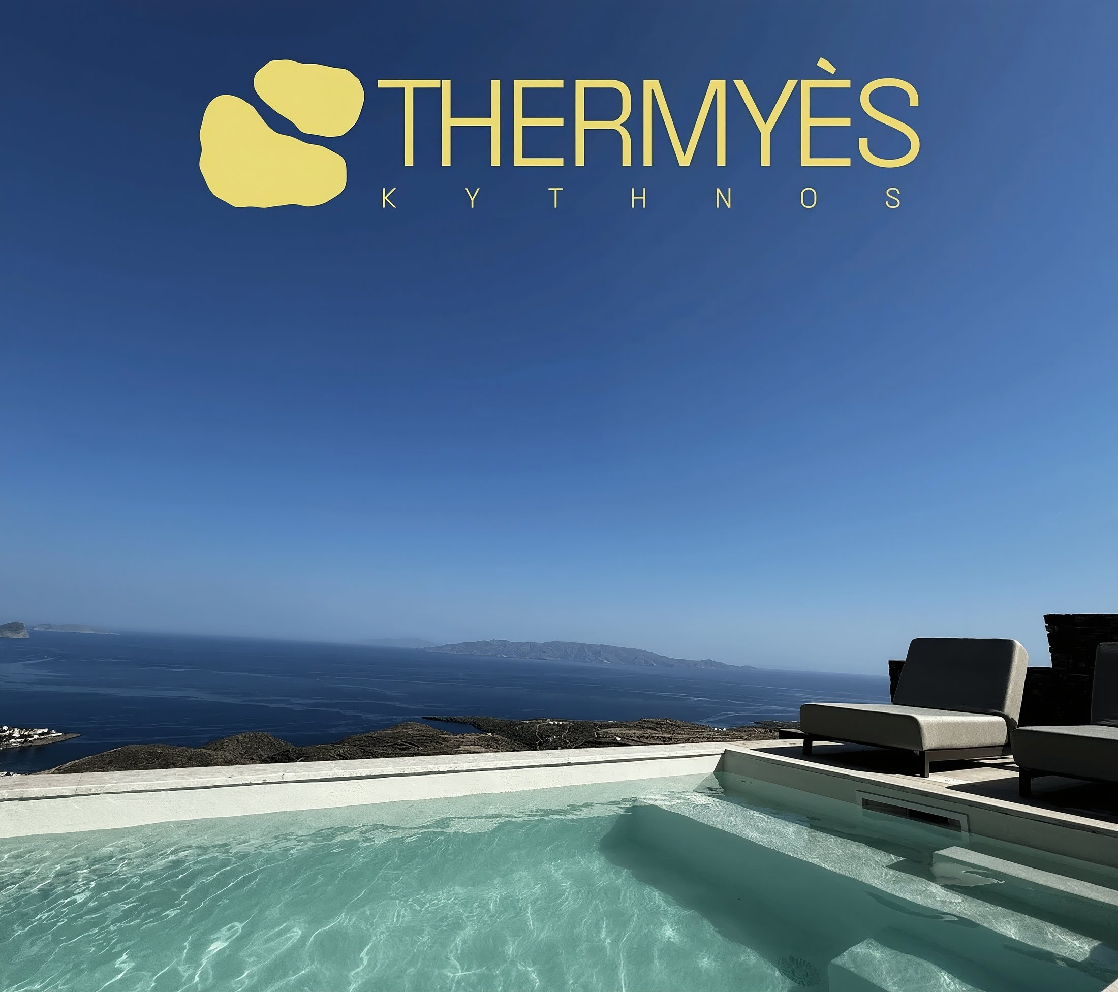
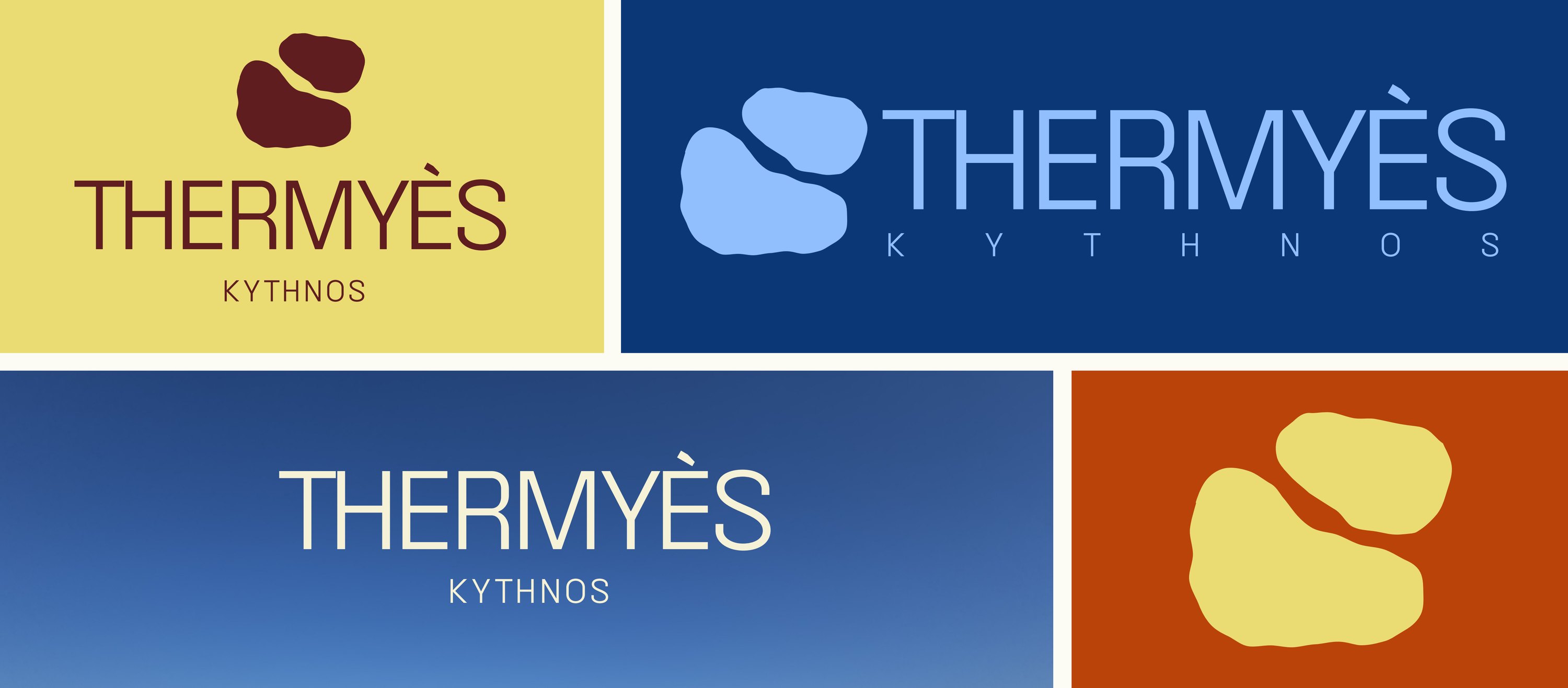
The logomark is the core signature of THERMYÈS.
The pattern
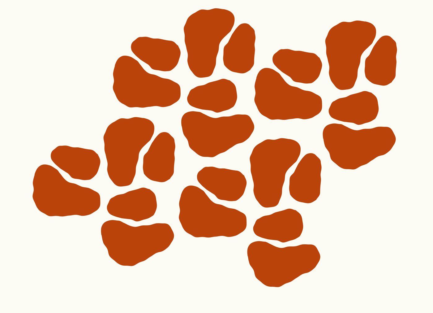
The pattern draws on the island’s lines and the flow of its thermal waters.
The backdrop
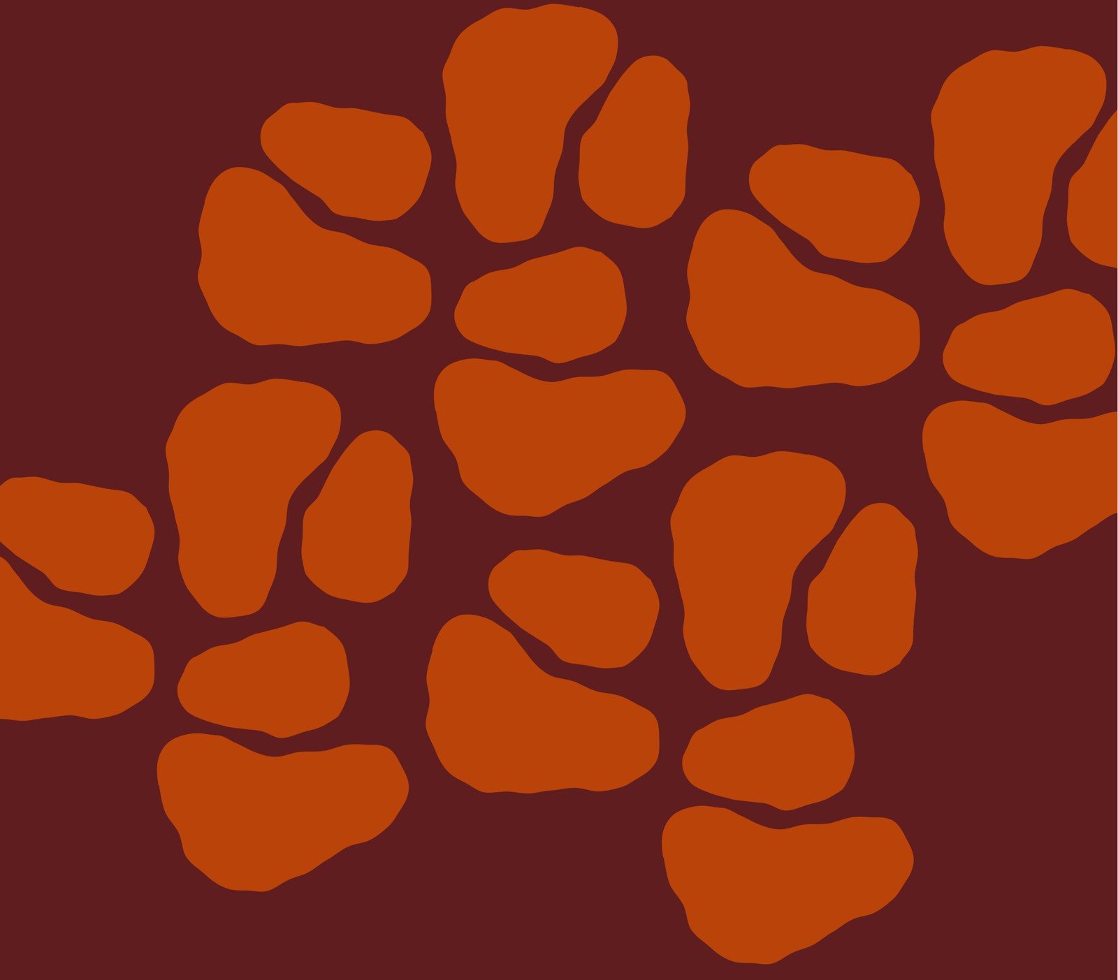
Repeated in a brand colour, the icon builds a bold backdrop.
The system.
Pair brand colours with strong contrast for warmth and clarity.
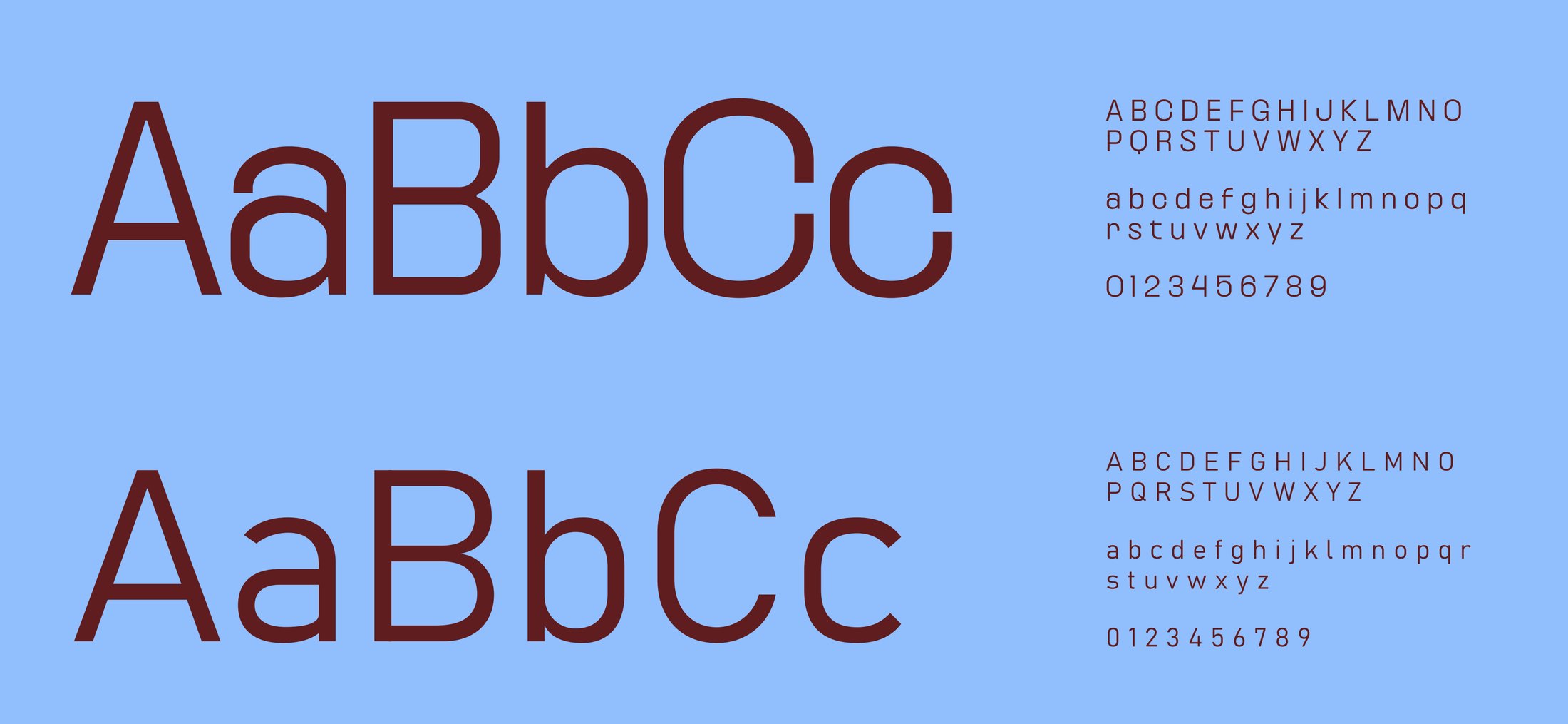
Kurdis carries the display headlines with character, while Bahnschrift handles body and supporting copy.
In use.


What we delivered.
- (01)Brand story
- (02)Logotype and logomark
- (03)Colour palette and pairings
- (04)Typography
- (05)Pattern and icon
- (06)Brand applications
- (07)Brand guidelines
 Phoenix Elevate.
Named after the thermal springs of Kythnos, rooted in warmth: of water, stone and light.
- ClientThermyès
- SectorVilla
- PlaceKythnos, Cyclades
- Year2026
Named after the thermal springs of Kythnos, THERMYÈS is rooted in warmth: of water, stone and light. Unhurried and elemental, it holds the character of the Cyclades in every detail.
The logomark is the core signature of THERMYÈS.
The pattern draws on the island’s lines and the flow of its thermal waters.
Repeated in a brand colour, the icon builds a bold backdrop.
Pair brand colours with strong contrast for warmth and clarity.
Kurdis carries the display headlines with character, while Bahnschrift handles body and supporting copy.
- (01)Brand story
- (02)Logotype and logomark
- (03)Colour palette and pairings
- (04)Typography
- (05)Pattern and icon
- (06)Brand applications
- (07)Brand guidelines
Phoenix Elevate.Named after the thermal springs of Kythnos, rooted in warmth: of water, stone and light.
- ClientThermyès
- SectorVilla
- PlaceKythnos, Cyclades
- Year2026
Named after the thermal springs of Kythnos, THERMYÈS is rooted in warmth: of water, stone and light. Unhurried and elemental, it holds the character of the Cyclades in every detail.
The logomark is the core signature of THERMYÈS.
The pattern draws on the island’s lines and the flow of its thermal waters.
Repeated in a brand colour, the icon builds a bold backdrop.
Pair brand colours with strong contrast for warmth and clarity.
Kurdis carries the display headlines with character, while Bahnschrift handles body and supporting copy.
- (01)Brand story
- (02)Logotype and logomark
- (03)Colour palette and pairings
- (04)Typography
- (05)Pattern and icon
- (06)Brand applications
- (07)Brand guidelines
Phoenix Elevate.Let’s talk
Let’s talk
Let’s talk
Tell us what you’re building. We read every brief ourselves.
Reply time
Within one business day, from a real person.